Category: Uncategorized

  • Campaign Button Design Mistakes: How to Make a 2.25-Inch Button Read at a Glance

    Campaign Button Design Mistakes: How to Make a 2.25-Inch Button Read at a Glance

    Most guidance on custom campaign buttons stops at the mechanics: which size, which back, how many to order. The part that decides whether a button gets worn all season or ends up in a drawer is the artwork, and that is where the avoidable mistakes cluster. A campaign button is one of the smallest canvases in political advertising, seen for a second or two from across a room, and it forgives nothing. This is a practical guide to designing one that reads instantly, built around the errors that most often send a proof back for a redo.

    Design for the face you actually get, not the size you ordered

    The first mistake happens before a single word is typed. The 2.25 inch round button, the standard for campaign and political use, is not a 2.25 inch design area. The outer sliver of the shell curves over the edge and wraps around to the back, so a portion of your artwork disappears from the flat, front-facing view. On a 2.25 inch button the comfortably usable face is closer to 1.9 inches, and the proportion of lost area grows as the button shrinks. Push a name or logo to the visual edge and the last letters curl over the rim exactly where people are trying to read them. Design toward the center, keep type and key elements inside the safe zone your printer’s template marks, and let only background color run into the bleed.
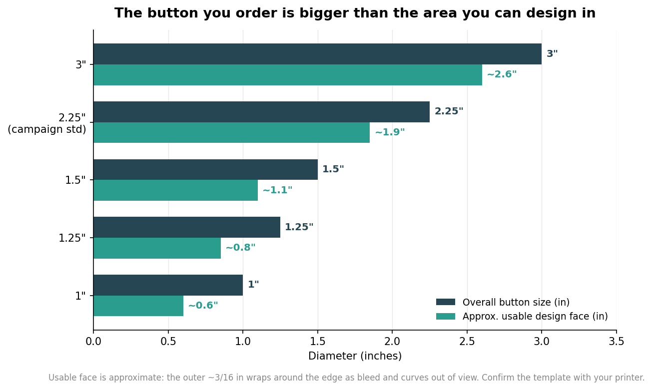
    Bar chart comparing overall button diameter to the approximate usable design face for 1 to 3 inch buttons
    Every button’s usable design face is smaller than its ordered size once the edge wrap is accounted for.

    Size choice is a design decision as much as a budget one. The 2.25 inch round is the campaign default because it gives a name room to breathe at a readable height. Step down to 1.25 or 1.5 inch buttons for volunteer badges and lapel pieces where the button plays a supporting role, and remember the usable face shrinks fast at those sizes, so simplify the art accordingly. Step up to 3 inch buttons when a photo of the candidate is central, since faces need the extra area to stay recognizable, and reserve jumbo rally shells for signage-style impact where the button is meant to be seen across a crowd rather than worn on a shirt.

    Put the name first, and size it to the room

    A campaign button has one job: make a name stick. That means the candidate’s name is the largest, boldest element, and everything else, office sought, slogan, year, is subordinate to it. A useful rule of thumb for legibility is roughly one inch of letter height for every ten feet of viewing distance. A worn button is typically read from about three to eight feet, at a rally, across a table, or in a checkout line, which puts the ideal capital-letter height for the name in the range of about three tenths to half an inch. On a 2.25 inch button that is easy to hit; the trap is stealing that height by cramming in a slogan. If the words compete, the name loses, and a button that does not deliver the name has failed at the only thing it needed to do.
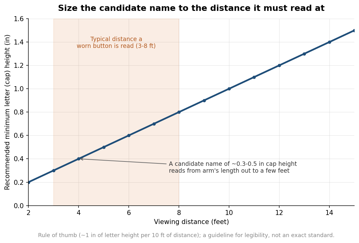
    Line chart of recommended minimum letter cap height versus viewing distance for a campaign button
    Sizing the candidate name to viewing distance using a one-inch-per-ten-feet rule of thumb.

    Contrast and color: bold beats clever

    Legibility at a glance is mostly a contrast problem. Dark type on a light field, or light type on a dark field, reads far faster than two mid-tone colors sitting next to each other, no matter how nicely they pair on screen. Red, white, and blue are the expected palette and they work, but only when you keep strong value contrast between the text and whatever sits behind it; navy on red, a common patriotic instinct, is much harder to read than navy on white or white on navy. Hold the design to two or three colors. A tight palette looks more confident, keeps the button from turning muddy at small size, and, if you ever print with spot colors rather than full-color digital, keeps the job simpler. Save gradients and drop shadows for larger formats; at button scale they mostly add noise.

    Typography and artwork quality

    Choose a clean, bold sans serif, or a sturdy serif, and steer away from script, handwriting, and thin display faces that fall apart when reduced to an inch or two. Weight matters more than personality here; a heavier face holds up when it is shrunk and viewed at speed. Keep any slogan short enough that all of it is visible at a glance rather than something people have to lean in and decode. On the production side, supply artwork as vector line work wherever possible so it stays crisp at any size, and if you must use a photograph or raster logo, provide it at high resolution so it does not turn pixelated when placed. A logo that looks fine on a website can be far too low-resolution for even a small button once it is enlarged to fill the face. Build the file in CMYK rather than RGB so the bright screen blues and reds you pick do not shift or dull unexpectedly in print, and extend the background past the trim into the bleed the template calls for, commonly about an eighth of an inch, so no white slivers appear at the wrapped edge.

    A quick pre-flight before you approve the proof

    Before signing off, run the design through a short check. View it at actual size on screen, not zoomed in, and then from a few feet back, because a design only ever judged at 400 percent will fool you about its real legibility. Confirm the name is unmistakably the dominant element and reads first. Check that nothing important, letters, faces, logo edges, sits in the outer wrap area. Verify you have strong light-to-dark contrast between text and background rather than two similar tones. Count your colors and cut anything the design does not need. Get those five things right and the button does its quiet work all season; the distance figures and usable-area numbers here are guidelines to design against, so always lay your art over the exact template your button maker provides.
  • Do Custom Campaign Buttons Need a ‘Paid for By’ Disclaimer? Plus the Union Bug, Explained

    Do Custom Campaign Buttons Need a ‘Paid for By’ Disclaimer? Plus the Union Bug, Explained

    Two questions come up on almost every campaign button order, and both have answers that surprise first-time buyers. The first is whether the button needs a “paid for by” disclaimer like a mailer or a yard sign. The second is whether it needs a union bug, the little printer’s mark you see tucked at the edge of political materials. The short version is that federal rules usually exempt the button itself from a disclaimer, and the union bug is a labor and party expectation rather than a printing law. The longer version is worth understanding before you approve artwork, because the exemption that frees your buttons does not free the rest of your program. This is general information, not legal advice; confirm specifics for your race with counsel or your state election office.

    The small-items exception: why a button usually carries no disclaimer

    Federal election rules require a “paid for by” disclaimer on most public communications a political committee pays for, but they carve out an explicit exception for objects where a disclaimer cannot be conveniently printed. The Federal Election Commission names the category directly, listing “pens, bumper stickers, campaign pins, campaign buttons and similar small items” as exempt. There is a companion exception for communications where a disclaimer would be impracticable, which the rules illustrate with examples as varied as wearing apparel, water towers, and skywriting. The logic is physical, not political: on a small round button there is no room for a legible funding line without crowding out the message.

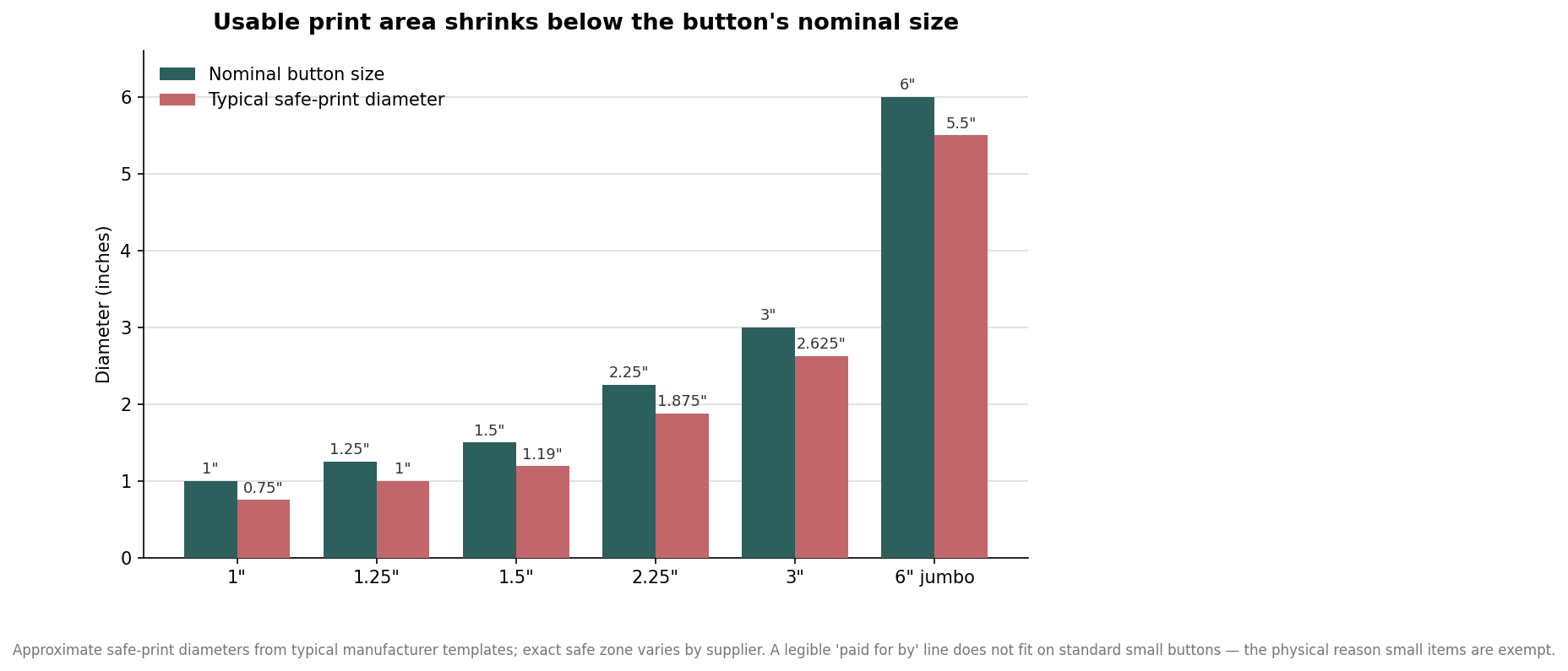
    Grouped bar chart comparing nominal campaign button sizes to their typical safe-print diameters from 1 inch to 6 inch jumbo
    A button’s safe-print area sits well inside its nominal size, which is why a legible disclaimer line does not fit on small buttons.

    The numbers make the exemption obvious. A button’s usable print area sits meaningfully inside its nominal diameter because the graphic has to wrap around the rolled edge, and the safe zone where text stays sharp is smaller still. On a one-inch or 1.25-inch button, the safe area is roughly three-quarters of an inch to an inch across, which is barely enough for a name and an office, let alone a committee’s full legal name and a “paid for by” line at readable size. That is exactly the situation the small-items exception was written for. It is why you can order a clean two-word button without a disclaimer and stay within federal rules.

    What still needs a disclaimer, even when your buttons do not

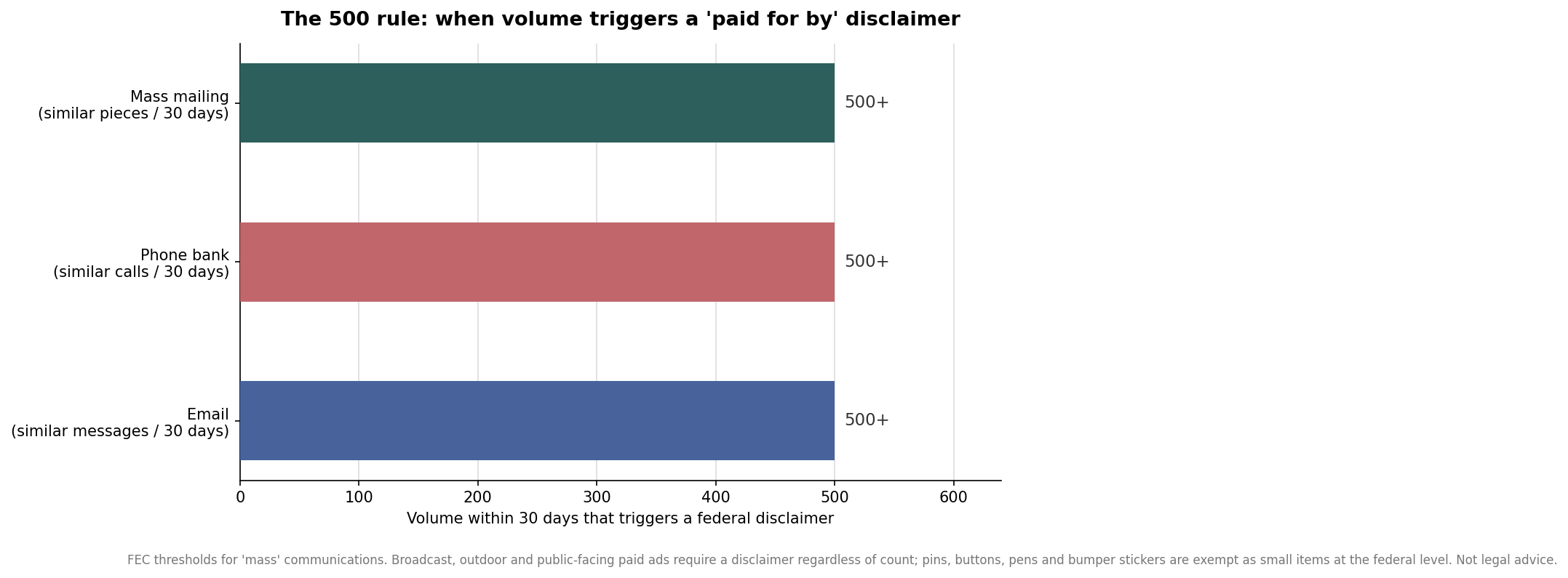
    The exemption is narrow. It covers the small item, not your whole outreach program, and campaigns get into trouble by assuming the button rule extends to everything else. Federal disclaimers attach to communications made in volume or to the public: a mass mailing, defined as more than 500 substantially similar pieces within 30 days, a phone bank of more than 500 similar calls in 30 days, and email programs of more than 500 substantially similar messages. Broadcast, cable, outdoor advertising, and paid public-facing digital ads require a disclaimer regardless of how many run.

    Horizontal bar chart showing the 500-unit federal thresholds for mass mailings, phone banks, and emails that trigger a paid for by disclaimer
    Mailings, calls, and emails over 500 within 30 days trigger a federal disclaimer; small campaign items like buttons are exempt.

    So the practical boundary is this: your pin-back buttons, pens, and bumper stickers can go out clean, but the postcard you mail to announce the rally, the robocall inviting people to it, and the boosted social post all carry the funding line. Treating the button exemption as blanket permission is one of the more common and avoidable compliance slips.

    The disclaimer wording that governs the rest of your materials

    Where a disclaimer is required, the wording follows a fixed pattern tied to who paid and who authorized the communication. A message paid for and authorized by the candidate’s own committee reads simply, in the form “Paid for by the Sam Jones for Congress Committee.” A message authorized by the campaign but paid for by someone else adds the authorization, as in “Paid for by the XYZ Committee and authorized by the Sam Jones for Congress Committee.” A message that the candidate did not authorize must say so and identify the payer with contact information, in the form “Paid for by the Court Jesters Union PAC and not authorized by any candidate or candidate’s committee.” Every required disclaimer has to be clear and conspicuous, whatever the medium. None of that has to appear on the button, but it should appear, correctly, on the materials that are not exempt.

    The union bug is a different question entirely

    A union bug is a small printed symbol certifying that a product was produced by union labor. It is not a federal election requirement and it is not a printing law in the general case. It functions as a signal to labor-aligned audiences and, for many Democratic and union-endorsed campaigns, as an expectation attached to endorsements and to certain contracts. Where it is genuinely required tends to be specific: union-commissioned work, some government contracts whose bidding rules mandate union printing, and campaigns whose labor backing comes with a condition that printed materials carry the mark. Plenty of organizations also choose union printing voluntarily for the credibility it carries with those audiences.

    Only certified union shops may apply a bug, and the marks are issued through recognized unions such as the Graphic Communications Conference of the Teamsters, the Communications Workers of America, and, for some trades, the International Union of Painters and Allied Trades. A printer cannot simply add the symbol; using one without certification invites real consequences. For buttons specifically, a union bug is usually a matter of whether your endorsement or your party’s expectations call for it, not whether the law does. If a labor endorsement is in play, ask early, because it constrains which shop can produce the run.

    How to order so compliance is not an afterthought

    Decide two things before you approve artwork. First, confirm whether any material in the order is not a small item, and make sure those pieces carry the correct disclaimer in the right form. Second, ask whether a union bug is expected for your race, and if so, specify it on the order and confirm the shop is certified to apply it, since that decision narrows your vendor options and can affect lead time. Keep the button face itself focused on the message and legible at a glance; the exemption exists precisely because fine print does not belong there. Where a rule here is stated in general terms, treat it as a starting point rather than a ruling on your situation. Federal law is only one layer, state and local election codes add their own requirements, and the safe move on any close call is a quick check with your compliance counsel or state election office before the run goes to print.

  • Campaign Button Back Styles: Pin, Clip, Magnet, and What to Order

    Campaign Button Back Styles: Pin, Clip, Magnet, and What to Order

    The artwork gets all the attention, but the small metal part on the back of a campaign button decides almost everything practical about it: where a volunteer can wear it, whether it survives a day of door-knocking, and whether a donor will actually put it on a wool blazer. Most first-time buyers order the default pin and never think about it again. If you are placing a real campaign order, the backing is worth two minutes of thought, because it is usually free to change and it is nearly impossible to fix after the buttons are pressed.

    The backing decides where the button can go

    The standard fastener on a round campaign button is a safety-pin back: a spring pin that bends and locks under a prong on the button shell. It is the cheapest option, it is what people expect, and it works on almost any shirt, tote bag, or hat. The tradeoff is that it pierces fabric, which most cotton and canvas shrug off but which can leave a visible hole in a silk scarf or a fine-gauge sweater. For a rally crowd handing buttons to strangers, the pierce-anything pin is exactly right. For a black-tie fundraiser where guests are in tailored clothing, it can be the wrong first impression.

    Two construction styles sit under that same pin. A fully metal shell with a pinned collet is the durable, weatherproof choice and the one most political shops press by default. A cardboard back with a stapled or glued safety pin costs less and can be fine for a single event, but it is the version that fails in a jacket pocket or a rain shower. When you are comparing two quotes that look far apart on price, the backing construction is often the hidden reason.

    Non-piercing options: bulldog clips and magnets

    When the wearer should not put a hole in their clothing, you have two good answers. A bulldog clip (sometimes called a pinch or swivel clip) attaches to a lapel, tie, shirt pocket, or badge lanyard by squeezing two wings and releasing. It swivels, so the button hangs straight, and it is the default for staff and press credentials at conventions. It costs more than a plain pin and it needs an edge to grip, so it will not clip onto the flat front of a t-shirt.

    A magnet back uses a magnet on the button and a second magnet or steel keeper behind the fabric, holding the button with no pin at all. It is the premium, no-holes choice for donors, board members, and anyone in expensive clothing. The cautions are real and worth stating plainly: magnets hold poorly through thick coats or heavy knits, the loose keeper piece is easy to drop and lose, and you should keep magnetic buttons away from pacemakers and from anything with a magnetic stripe or a hard drive. For a targeted VIP giveaway, magnets feel considered. For ten thousand street buttons, they are an expensive answer to a problem you do not have.

    Specialty backs for ribbons, keys, and awards

    Beyond the three everyday choices, a handful of specialty fasteners solve narrow problems. Two-prong and bridal-hook backs are made to sit on top of an award rosette or to thread a ribbon, which is how you get the delegate ribbons and volunteer-of-the-year badges you see at state conventions. A keychain back turns the same printed shell into a takeaway that lives on a set of keys long after the yard signs come down, which stretches your branding past election day. There are even bottle-opener backs for the after-party. None of these are campaign staples, but if your order includes a VIP tier or a thank-you gift, mixing in a small run of a specialty back is a cheap way to make part of the order feel distinct.

    Size still sets the tone, from 1 inch to 3 inch

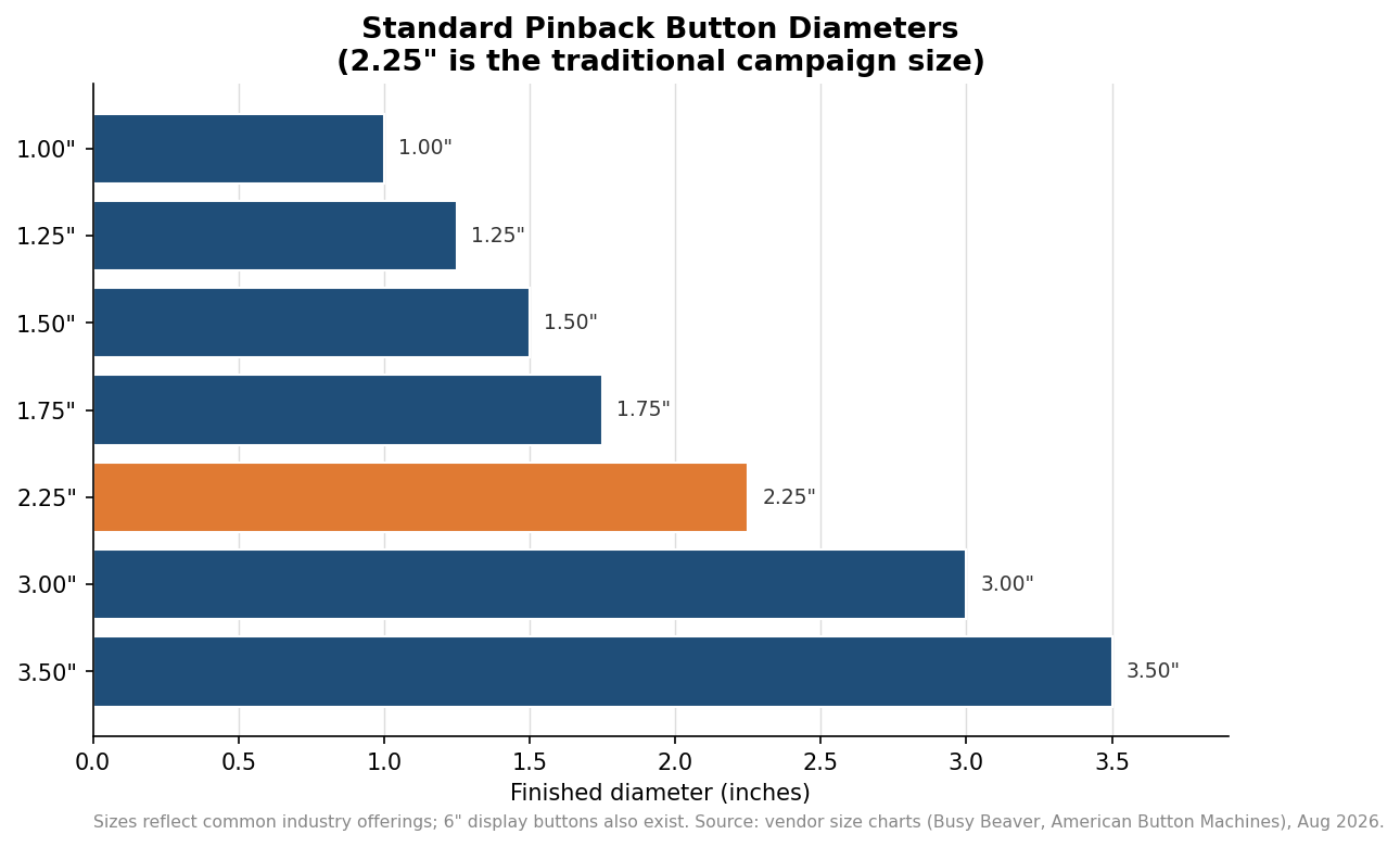
    Backing answers where; size answers how loud. The 2.25-inch round is the traditional campaign size, roughly the diameter of the top of a soda can, big enough to carry a name and a slogan and still pin cleanly to a shirt. It has been the political default for decades for a reason. The 1-inch and 1.25-inch buttons read as modern and understated and have become popular for merch tables and low-key supporter pins, but at that size you can realistically fit a logo or a short name, not a full ticket and tagline. Step up to 3-inch for a booth centerpiece or a photo button, and to 6-inch only for a display stand rather than something anyone wears. As a rule, pick the size for the smallest thing that must be legible at arm’s length, then confirm your art still breathes inside the safe area once the wrap and bleed are accounted for.

    Horizontal bar chart comparing standard pinback button diameters from 1 inch to 3.5 inches, with the 2.25 inch campaign size highlighted
    The 2.25-inch round remains the traditional campaign size; smaller 1-inch buttons suit merch and low-key supporter pins.

    What a backing choice does to your budget

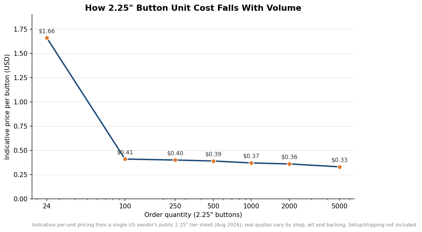
    Two forces move the per-button price: the backing you choose and the quantity you order. Upgrading from a plain safety pin to a bulldog clip or a magnet adds cost to every unit, and on a large run that surcharge is the difference between one backing for the whole order and a split order. Quantity moves the number far more dramatically. Custom buttons follow a steep bulk curve: the jump from a couple dozen to a few hundred can cut the unit price to a fraction of the small-run rate, after which the curve flattens and each additional thousand saves only pennies. The indicative figures below come from one US vendor’s public price sheet for a plain-back 2.25-inch button; treat the shape of the curve as the lesson, not the exact cents, because setup, artwork, backing upgrades, and shipping all sit on top and every shop prices them differently.

    Line chart showing indicative per-button price for 2.25 inch buttons dropping steeply from about 1.66 dollars at 24 units to about 0.33 dollars at 5000 units
    Unit cost drops sharply from small runs into the hundreds, then flattens – indicative figures from one vendor’s public 2.25-inch price sheet.

    The practical takeaway for a campaign order is to decide the backing before you decide the quantity, because the two interact. If most of your buttons are street giveaways, order the bulk of the run on plain safety pins where the volume discount is deepest, and carve out a small, separately specified batch of magnet or clip backs for donors and staff. That way you pay the premium only where it earns its keep, you hit the price break on the large plain-back run, and nobody at the fundraiser has to decide whether your button is worth a hole in their jacket.

  • Why the Last Letter Curls Over the Edge

    A button that arrives with a surname running off the rim was almost never printed wrongly. It was designed to the diameter of the shell, which is not the area anybody can read.

    A button is not a flat disc

    The printed circle is larger than the shell, because it has to fold over the dome.

    The outer band of that circle finishes on the side of the button, facing nobody.

    And then it is crimped

    The very edge tucks under the rim during pressing and disappears completely.

    Between the curve and the crimp, roughly a quarter inch of printed diameter is gone on a 2.25 in button.

    Which is why we quote four numbers

    Shell size, printed diameter, bleed, live area. Only the last one is what a person reads.

    A supplier who will give you only the first is not being dishonest, but you are being handed the least useful of the four.

    Ask for the ring on the proof

    A live-area ring drawn over your own artwork settles the argument in two seconds.

    Anything important that sits outside it will not survive the press.

  • The Complete Buyer’s Guide to Custom Campaign Buttons

    Buttons get compared on diameter and unit price, because those are the only two numbers most suppliers publish. Neither of the first two questions below is about either of them.

    How much of the face can I actually use?

    A button prints flat and finishes domed, so the artwork wraps over the curve and tucks under the crimped rim.

    Ask for the live area as its own number. On a 2.25 in shell it is roughly a quarter inch smaller in diameter than the print.

    How far does it have to read?

    One inch is conversation distance. 2.25 in crosses a room. Three inch crosses a hall.

    Six inch reads down a rally line and photographs well, which is a different job again.

    What is on the back?

    A safety pin puts a hole in fabric, which decides whether knitwear and suiting audiences ever wear it.

    A magnet pierces nothing. A locking pin stays square. A clip suits lanyards.

    Does the disclaimer have to fit?

    Small items on which a disclaimer cannot conveniently be printed are generally exempt under federal rules, and buttons are named among them.

    State rules differ and your counsel decides. Ask before you shrink a name to fit it.

    Then choose the colour

    Enjoyable, and safely secondary to the four above.

  • What Size Button Do You Actually Need?

    Size is treated as a budget lever. It is really a legibility spec, and the two pull in opposite directions.

    One inch: conversation distance

    Room for one word in a strong weight, and very little else.

    Genuinely right for role buttons — VOLUNTEER, GREETER — and wrong for a name and an office.

    Two and a quarter: across a room

    The default for a reason. A name, a short line and a mark all read comfortably.

    This is the size most campaigns should be ordering and the size most under-order.

    Three inch: across a hall

    A name, an office and a strapline without any of it dropping below readable.

    Worth the extra cost the moment the room is bigger than an office.

    Six inch: down a rally line

    Reads at distance and survives being cropped into a photograph.

    Needs a reinforced or locking pin, or it tips forward on soft fabric.

    The honest test

    Stand where the furthest person will stand and ask whether a name would read from there.

    If it would not, the cheaper button has cost you the whole order.

  • How to Spec a Custom Campaign Button: Sizes, Artwork, Quantities, and the Disclaimer Rule

    How to Spec a Custom Campaign Button: Sizes, Artwork, Quantities, and the Disclaimer Rule

    A campaign button looks like the simplest thing you will ever order, which is exactly why so many first orders go wrong. The text runs too close to the edge and gets swallowed by the rim, the photo pixelates at three inches, or a volunteer prints a thousand at a size nobody wants to wear. None of that is hard to avoid once you know how a button is actually built and what the printer needs from you. This is the practical walkthrough, from picking a size to the one legal question campaigns always ask.

    Start with the size, because it sets everything else

    Pinback buttons come in a small set of standard diameters, and the choice is not just aesthetic. The common rounds are 1 inch, 1.25 inch, 1.5 inch, 2.25 inch, and 3 inch, with oversized 6 inch display buttons for tables and rallies. For campaigns, the 2.25 inch round is the long-standing standard; it is large enough to carry a name and a simple logo legibly, small enough to wear comfortably on a lapel, and it is what most supporters expect a campaign button to look like. The 1 inch and 1.25 inch sizes are cheaper and popular for bulk giveaways and merch tables, but they force you to a logo or a single short word. The 3 inch is the right call when you want a photo or a two-line message to read across a room. Pick the smallest size that comfortably holds your message, then design to that size specifically.

    Design inside the safe area, or lose your text to the rim

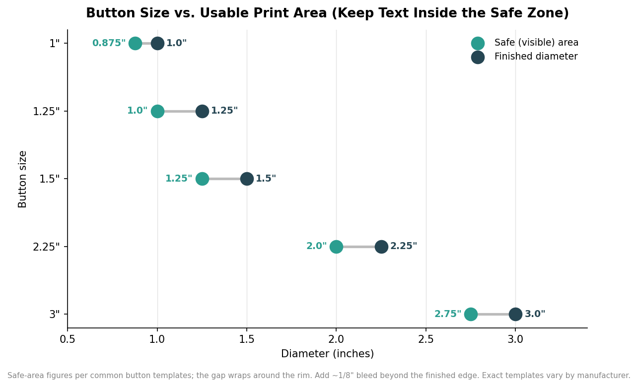
    The mistake that ruins more button artwork than any other is treating the finished diameter as the usable space. It is not. A button is made by wrapping a printed disc over a metal shell, so a ring around the outside edge curves down and around the rim where it is hard to read or partly hidden. Printers account for this with two zones: a bleed, usually about one-eighth of an inch, that extends your background past the cut line so no white edge shows, and a safe area, set in from the edge, where all text and important elements must stay. The gap between them is real, and it is bigger than people expect.

    Dumbbell chart comparing finished button diameter to the smaller safe (visible) print-area diameter for 1, 1.25, 1.5, 2.25 and 3 inch buttons
    The usable safe area is meaningfully smaller than the finished diameter; keep all text inside it.

    On a 2.25 inch button, the safe area is only about 2.0 inches across; on a 1 inch button it is roughly 0.875 inches. That means a 2.25 inch button gives you a two-inch canvas for anything that has to be readable, and everything outside it should be background you are willing to lose to the wrap. Build your file at 300 DPI, extend the background to the full bleed, keep the candidate name and any URL comfortably inside the safe circle, and avoid thin borders that ring the edge, because a border is the one design element guaranteed to look crooked once it wraps. Exact template sizes vary slightly by manufacturer, so download the printer’s template for your chosen size rather than guessing.

    Order the right quantity, because the price curve is steep then flat

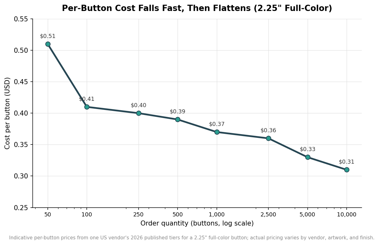
    Buttons are cheap to make and cheaper in bulk, but the savings are front-loaded. The per-button price drops sharply from small runs to a few hundred, then flattens out, so the money question is usually not how low can I go but how many will I actually hand out. As an indicative example, one US vendor’s published 2026 tiers for a 2.25 inch full-color button run about $0.51 each at 50, around $0.41 at 100, roughly $0.39 at 500, and near $0.31 at 10,000. The shape of that curve is the point.

    Line chart on a log scale showing per-button cost for a 2.25 inch full-color button falling from about 51 cents at 50 units to 31 cents at 10,000 units
    Per-button cost drops fast up to a few hundred, then flattens, so most of the discount comes early.

    Read practically, the chart says that jumping from 50 to 500 buttons cuts your unit cost by about a quarter, while going from 5,000 to 10,000 barely moves it. For most local and regional campaigns, ordering in the few-hundred to low-thousands range captures nearly all the bulk discount without leaving boxes of buttons in a closet after election day. If you expect multiple waves, such as a primary run and a general run, it is often smarter to reorder than to over-buy up front, since artwork can change and a dated button is a wasted button. These figures are one vendor’s example and will vary with artwork, finish, and supplier, so treat them as the pattern rather than a quote.

    The disclaimer question: buttons are usually exempt

    Every federal campaign eventually asks whether the button needs a “paid for by” disclaimer, the notice required on most campaign advertising. For buttons, the answer under federal rules is generally no. The FEC’s disclaimer regulation contains a small-items exemption for materials where a disclaimer cannot be conveniently printed, and it names the category directly, listing “pens, bumper stickers, campaign pins, campaign buttons and similar small items” as examples. A separate exemption covers items where display is impracticable, such as wearing apparel and skywriting. In plain terms, a standard campaign button does not have to carry the “paid for by” line, which is part of why designers can use the whole face for the message.

    Two cautions belong with that. First, the exemption is about federal law under the FEC; state and local election authorities set their own rules, and a few have different requirements, so a campaign should confirm its own jurisdiction’s rules rather than assume the federal exemption controls everywhere. This is general information, not legal advice, and anything with real stakes is worth a quick check with your campaign counsel or compliance staff. Second, the exemption removes an obligation, not an option: if you want to include a small disclaimer or a union bug for transparency, nothing stops you, as long as it stays inside the safe area with everything else. Spec the size to the message, design inside the safe circle, order the quantity you will actually use, and confirm your local rules, and the simplest thing you will order will also be the one that comes back exactly right.

  • Hello world!

    Welcome to WordPress. This is your first post. Edit or delete it, then start writing!