Most guidance on custom campaign buttons stops at the mechanics: which size, which back, how many to order. The part that decides whether a button gets worn all season or ends up in a drawer is the artwork, and that is where the avoidable mistakes cluster. A campaign button is one of the smallest canvases in political advertising, seen for a second or two from across a room, and it forgives nothing. This is a practical guide to designing one that reads instantly, built around the errors that most often send a proof back for a redo.
Design for the face you actually get, not the size you ordered
The first mistake happens before a single word is typed. The 2.25 inch round button, the standard for campaign and political use, is not a 2.25 inch design area. The outer sliver of the shell curves over the edge and wraps around to the back, so a portion of your artwork disappears from the flat, front-facing view. On a 2.25 inch button the comfortably usable face is closer to 1.9 inches, and the proportion of lost area grows as the button shrinks. Push a name or logo to the visual edge and the last letters curl over the rim exactly where people are trying to read them. Design toward the center, keep type and key elements inside the safe zone your printer’s template marks, and let only background color run into the bleed.
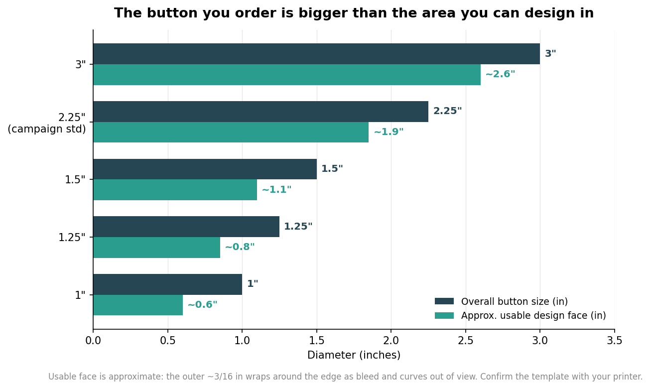
Size choice is a design decision as much as a budget one. The 2.25 inch round is the campaign default because it gives a name room to breathe at a readable height. Step down to 1.25 or 1.5 inch buttons for volunteer badges and lapel pieces where the button plays a supporting role, and remember the usable face shrinks fast at those sizes, so simplify the art accordingly. Step up to 3 inch buttons when a photo of the candidate is central, since faces need the extra area to stay recognizable, and reserve jumbo rally shells for signage-style impact where the button is meant to be seen across a crowd rather than worn on a shirt.
Put the name first, and size it to the room
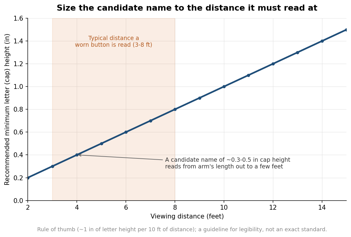
A campaign button has one job: make a name stick. That means the candidate’s name is the largest, boldest element, and everything else, office sought, slogan, year, is subordinate to it. A useful rule of thumb for legibility is roughly one inch of letter height for every ten feet of viewing distance. A worn button is typically read from about three to eight feet, at a rally, across a table, or in a checkout line, which puts the ideal capital-letter height for the name in the range of about three tenths to half an inch. On a 2.25 inch button that is easy to hit; the trap is stealing that height by cramming in a slogan. If the words compete, the name loses, and a button that does not deliver the name has failed at the only thing it needed to do.
Contrast and color: bold beats clever
Legibility at a glance is mostly a contrast problem. Dark type on a light field, or light type on a dark field, reads far faster than two mid-tone colors sitting next to each other, no matter how nicely they pair on screen. Red, white, and blue are the expected palette and they work, but only when you keep strong value contrast between the text and whatever sits behind it; navy on red, a common patriotic instinct, is much harder to read than navy on white or white on navy. Hold the design to two or three colors. A tight palette looks more confident, keeps the button from turning muddy at small size, and, if you ever print with spot colors rather than full-color digital, keeps the job simpler. Save gradients and drop shadows for larger formats; at button scale they mostly add noise.
Typography and artwork quality
Choose a clean, bold sans serif, or a sturdy serif, and steer away from script, handwriting, and thin display faces that fall apart when reduced to an inch or two. Weight matters more than personality here; a heavier face holds up when it is shrunk and viewed at speed. Keep any slogan short enough that all of it is visible at a glance rather than something people have to lean in and decode. On the production side, supply artwork as vector line work wherever possible so it stays crisp at any size, and if you must use a photograph or raster logo, provide it at high resolution so it does not turn pixelated when placed. A logo that looks fine on a website can be far too low-resolution for even a small button once it is enlarged to fill the face. Build the file in CMYK rather than RGB so the bright screen blues and reds you pick do not shift or dull unexpectedly in print, and extend the background past the trim into the bleed the template calls for, commonly about an eighth of an inch, so no white slivers appear at the wrapped edge.
A quick pre-flight before you approve the proof
Before signing off, run the design through a short check. View it at actual size on screen, not zoomed in, and then from a few feet back, because a design only ever judged at 400 percent will fool you about its real legibility. Confirm the name is unmistakably the dominant element and reads first. Check that nothing important, letters, faces, logo edges, sits in the outer wrap area. Verify you have strong light-to-dark contrast between text and background rather than two similar tones. Count your colors and cut anything the design does not need. Get those five things right and the button does its quiet work all season; the distance figures and usable-area numbers here are guidelines to design against, so always lay your art over the exact template your button maker provides.